
Back in the early days of the internet, affiliate marketing was a lot simpler affair than today. Simple display ads including banner ads like the one below —the first banner — would perform incredibly well.

But now, with growing banner blindness, the improved quality of internet content, as well as negative past experiences of clicking on banner ads, internet users are much less willing to click on any old rubbish.
However, banner ads aren’t dead and when used right, they can deliver a healthy return for affiliate marketers. But what makes a good banner ad? And how can you conduct a successful experiment to improve the performance of your banner ads?
Well, today we dive deep into effective banner ads and how to improve your ad performance campaigns.
Improving banner efficiency
1. Optimize your images
In most cases, you will use images for your ads. If your images are poor performing and not optimized, then you risk:
- Having your advert rejected by the traffic source
- Getting worse advertising positions on a page
- Your image getting distorted
- Loading slowly and being ignored by the web page visitor.
There are two easy things for you to do to avoid this.
- Make sure your images fit the recommended dimensions and advertising guidelines
- Put your images through an optimizing tool to reduce their size and load time.
2. Be careful with your design
Simple design choices that you make, such as:
- the fonts you choose
- the color pallet
- the layout of the advert
can have a dramatic impact on your banner ads performance. Check out our article on some of the basics of design psychology that can help you improve your banner ad design.
3. Buy good ad positions
Not all advertising spaces are equal. If you buy advertising space below the fold, there’s a higher chance they won’t be seen by an internet explorer. In contrast, adverts within the content are the most likely to be seen.
If you bid low, there’s a good chance you will be getting worse ad placements.
Unfortunately, this means you may have to up your bids to see a boost in performance.
Another great option is to track what traffic sources and placements perform well, and your traffic source allows you to run whitelist campaigns.
Voluum Automizer allows you to create rules that will automatically create and populate whitelists with the best performing ad placements.

4. Be easy to read
If someone can’t read or understand your test or images, then they can’t take in the information and be convinced. If you have text on a background, you want a high contrast between colors.
Light grey text on a white background is harder to read than black text on a white background. Similarly, it’s easier to read text with a consistent color background, than a complex patter.
So, again, white text on black background is easy, but white text on top of a picture of a forest is much more difficult.
5. Be easy to understand
3 second.
That’s roughly how long someone will see your advert.
In that time, you have to convince someone that they should give you their attention.
If you try to get them to read a complicated essay with an obscure message and value, then you’re not going to get any clicks.
You can use one of the many readability assessment tools to check, how easy your text is to digest.
A clear banner ad doesn’t just apply to the text, but also to the image. Make sure it’s relevant to the advert so you convince the right people to click.
6. Give a reason to click
If your advert is easy to read and understand but doesn’t give a reason to click, then why would anyone? You need to find a reason to convince people to click and it has to fit within your banner ad space.
If you look at the very first banner ad, it did give a reason, curiosity! Most users wouldn’t be so curious now, so you need to find a new way.
Some reasons people click include
- curiosity
- excitement
- fear
- promises a solution
7. Not all traffic is good traffic.
One frequently overlooked point of banner ads is that not all visits are good. If someone comes to your lander and doesn’t continue along the campaign path, then they aren’t as valuable as a visitor which leads to a conversion.
There will always be some lost conversions along a funnel, but if you have very high visits and low clicks and conversions, something is wrong.
A common cause for this problem is that your advert, lander, and offer don’t have the same message or appeal.
Let’s use a ridiculous example. Imagine you had an advert for a hotel, but when you click, you’re taken to a completely irrelevant t-shirt store. You might get lucky and make a couple of sales somehow, but it would be much easier to get sales for something related.
The same is true for campaigns which present a cheaper item, but then try to sell a more expensive item. A better tactic is to present multiple offers including the item you targeted but also a more expensive option.

8. Don’t be the same as everyone
If you follow everyone else and your ads look like every other ad, then you risk blending in. By taking a unique approach you can stand out. This might be how you present your offer or the design you choose.
Obviously, there are often reasons why advertising standards form, but it’s worth testing variations which break the typical mold. You never know what will stand out today and become the standard tomorrow.
A/B testing vs Multivariant testing
Many people sing the praises of A/B testing and for good reason. A/B testing lets you run two different options and discover which performs the best. It’s a core part of optimizing and is used in many fields and different areas, not just affiliate marketing.
However, A/B testing isn’t the only option, there is also Multivariant testing.
Unlike A/B testing, which is limited to two options preferably with one small difference between them, Multivariant testing allows you to try several differences in different combinations. For example, you can try three different images and four different headlines.
Neither is inherently better, but they are certain situations when you might want to use one rather than the other.
Multivariant testing
A/B testing
- Great when starting out
- Great to test a lot of different ideas
- Requires more traffic to get significant results
- Great for optimizing
- Great for refining individual audiences/refined targets
- Great for testing a single small change
- Great after your ad campaign has been running for a while (checks it still works)
- Needs less traffic
So as a rule of thumb, it’s good if you can start with multivariant testing to test a lot of different ideas and then move to landing page A/B testing to help refine your results.
Voluum was designed to enable both types of testing in manual and automatic mode. The latter is backed by Voluum’s proprietary AI technology that helps to find the best performing path, lander, and/or offer.
Of course, to be able to test some variations, you need to have some ideas to test out. Here are some experiments that you can try to improve the performance of your banner adverts.
6 Banner Ads Experiments to Try
By now, you should have some good ideas about how to improve your advertising campaign, but you may not have one clear option to pursue. At this point, it’s time to test your options.
Your experiments, however, should go further than just these obvious ideas and try some different directions to discover fresh opportunities.
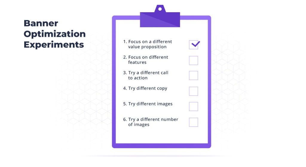
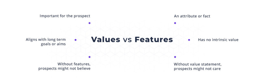
1. Focus on different value propositions
A value proposition is what you focus on to appeal to someone looking at your advert. If you were selling a smartphone your value proposition could be:
- The photography features
- The stylish design
- The ability to use it all day
- A 20% off discount
- The low price of …
And many more options. You might think that your offer only has one value proposition, but you might be able to rephrase the value proposition to make it more appealing.
2. Focus on different features
This is similar to the last point, but not completely the same. Your value proposition is the reason to choose these options and not something else. The features provide the evidence that the device does what you expect it to and meets your other requirements.
The value proposition attracts, the features prove.
You can highlight features by listing them, or in some cases using an image which focused on those aspects.
3. Try a different call to action
The call to action is the clear, and effective message to take the next step which you desire.
In the case of a banner ad, to click the image. In this context, it will probably be text or text within a button.
Some common calls to action are:
- Buy
- Click here
- Purchase
- Find out more
- Tell me more
Some calls to action require more to persuade a person
For example, people need more information to buy than to want to find out more.
Experimenting with different calls to action can help you increase your visits on your landing pages.
4. Try different copy
Although some of the previous points have hinted at this element. It’s worth explicitly stating. Changing the text, copy, in your banner ad is a worthy experiment.
You may choose not to focus on a different value proposition, features, or call to action, but simply a different choice of words or word order.
When it comes to copy experimentation, it worth asking “why would someone care?” and “what are they worried about?” When you are experimenting, imagine your copy doesn’t work at all and then try to go from there.
5. Try different images
Images can have a big impact on your ads’ performance. If you have a graphical component to your ad, then try different variations.
If it’s an advert for some clothing, you can try the clothing on its own, someone wearing in the clothing, someone looking at the clothing and so on.
Your image may appeal to different emotions or difficult segments of your audience. A good tracker will then let you redistribute this traffic.
6. Try a different number of images or change arrangements
Your banner ads might provide space for one image or multiple. You might find that a single large image is more effective than multiple smaller images, or the reverse.
In general, single images seem more effective as they are more attention-grabbing. This is not always true though and experimentation is always encouraged to make sure trends aren’t changing or apply to every situation.
Additionally, your banner ad will probably have different elements in different locations. These probably include
- Image
- Headline
- Tagline/subheadline
- Call to action
You may have further writing with different features or multiple images, but these will probably be your core elements and there are many ways you can arrange them. The image could be in the background with the headline, subheadline and then call to action.
Or the image could be to one side with the same order. OR the call to action could be below the image with the headline and subheader on the other side.
Have a theory, test it out
Banner optimization involves following proven practices with a healthy dose of experimentation to investigate new opportunities. These experiments should not be random stabs in the dark, but informed, educated theories which you test. This is what makes affiliate marketing unique: a mixture of scientific and creative elements.
Both elements could use a good tracker to gather data and test various hypothesis. Don’t wait.


