We all want more sales, right? Unfortunately, sometimes we get in our own way. Today, we’ll look at how you can boost your sales with landing page optimization best practices.
But first a story.
Imagine going into a clothes store and immediately you get shoved in front of the cashier with some clothing item order rung up. That’s what it’s like if you don’t have a landing page.
If the item was a perfect match you might end up buying it, but the chances are you wouldn’t. You’d want to know a little about it, perhaps compare a few options or ask some questions about it.
Whether you’re selling something in real life or online, you can’t go straight to sale.
Your ad is like a storefront, and the offer is a sales register. Then the landing page is the store layout and salespeople.
Landing pages provide a great opportunity to convince prospects, but if you poorly implement a landing page, it will put prospects off.
Just as you can immediately regret walking into a push, badly laid out shop, so can a bad landing page stop conversions. On the other hand, a well-crafted landing page can be like a beautifully crafted store that guides the user to the right option for them with helpful suggestions and explanations. This is a surefire way to increase conversion rates.
What is a Landing page?
A landing page, called often a “lander”, is one of many names for a web page where a visitor is directed to and has a specific action they are encouraged to take.
While this is also known as a “landing page” by some, that can be used to refer to the first page a user “lands” on, even if it is a page that allows the user to explore the site (such as a homepage). That’s why we use the term “Lander” in our documentation and panel.
Other terms like “pre-sales page” focus on more specific types of landing pages which have specific action intents (selling rather than an email subscription for example).
Other terms for landers include:
- Landing page
- Sales page
- Lead capture page
- Pre-sales page
- Static page
- Destination page
- CTA page
- Pre-lander
What is different between pre-landers and landers?
One of the more confusing terms is a “pre-lander”, some sources use it in the same way as they use lander, others use it to refer to a landing page before another landing page. In the second case, the flow might go. Traffic source > pre-lander > landing page > offer sales page.
A flow with a pre-lander can increase the length of sales material but not overwhelm a prospect after they click on your advertisement.
If a prospect has come from a link or a shorter advertisement, they might find a long landing page to be overwhelming compared to a funnel with a short pre-lander followed by another lander.
It’s important to note that some affiliate networks do not support pre-landers as they can be used to obscure sources of traffic.
If you come across the term pre-lander, check if this term actually means a lander, or a separate step earlier in the funnel.
Why use a Landing page?
You might think that adding in a landing page is an extra unnecessary step, but that’s not true at all.
In general, a landing page is designed to encourage a particular action such as convincing someone to complete a purchase or sign up for an email list. As we mentioned at the start, it’s rare for someone to be fully convinced by just an advert, they usually need some more information showing the benefits of a product and reassuring their fears to convert.
In addition, landing pages can have multiple offers which can appeal to different groups of prospects including personality types, needs or how much money they have. Providing options works because it not only helps you tailor your offers for different users, but the user feels more in control when they have some choice.
In short, landing pages improve your conversion rates.
But when you add in an extra step to a sales funnel, you need to optimize it. That’s why it’s important to optimize your landing pages with best practices.
How to evaluate a landing page?
This might seem like a stupid question but the answer may not actually be so obvious. Your gut instinct probably suggests one of two metrics is the clear metric to evaluate a landing page by. Either you viewed click-through rate or the offer conversion rate as the most important.
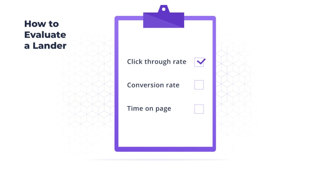
The click-through rate (also called landing page conversion rate and “clicks” in Voluum) is a useful metric because it shows how effective your lander was in getting people to take go to the next step. The Click-through rate doesn’t, however, show you what happened next. You could have a 90% click rate but if you the lander doesn’t match the offer page suitably, you will see a much lower conversion rate.
Your offer conversion rate (called “conversions” in Voluum) shows how many people finally convert. If your landing page convinces people to take the action you desire, then you should see a good return here. So, the conversion rate can help you evaluate the effectiveness of the landing page and offer in combination.
On the other hand, if you have a high conversion rate but a low click rate then your lander may not really be working and conversions only happen because people REALLY want what you offer.
Plus, we can’t forget the impact of the offer on the conversion rate. You may do everything right but if the offer just isn’t good enough, your conversion rates will still be low.
These two metrics really need to be used together to evaluate how effective your landing page is.
But there is one more metric that can help evaluate and refine your landing page. Time on page.
This is the time someone spends on a landing page before either clicking through, or converting. For some offers, a short time on page may be more common, in other cases a longer time may be more common.
By using these three metrics together you can glean more insights into where your issues lie. You can then use this data to make informed A/B tests to affect one or more of these statistics.
The key to a successful landing page
Now we know how to evaluate a lander, we can consider the key ingredients of conversion rate optimization. Although there are many different types of landing pages, seeking different purposes, there are some key aspects a good landing page should do regardless of its exact nature.
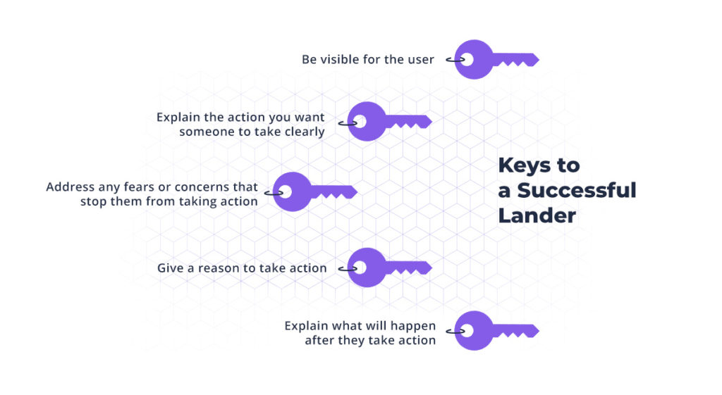
As a landing page is designed to convince someone to take a certain course of action it needs to:
- Be visible for the user (can’t see it, nothing happens)
- Clearly explain the action you want someone to take
- Give a reason to take that action
- Address any fears or concerns that would stop them from taking that action
- Explain what will happen after they take that action
Some of these elements will be very different depending on what the purpose of the landing page is. For example, if the action is a lower risk for the prospect (Download a free report compared to buying a $1000 product) then you don’t need to address as many fears.
Alternatively, with an expensive service, you might need to address more concerns and clearly explain what happens after they take action. If they think they just need to click the button and everything is finished but they really have to reply to an email you send them, then you risk not achieving your final goal.
As a general rule, the lower cost an action takes, along with the more familiar a user is with the concept, the less content you need on a landing page. The more unusual and costly an action, the more you need to show the benefits, explain what they need to do and calm their fears.
Understanding these keys to a successful landing page puts you in a great position to boost your sales with landing page optimization. But there are some tactics that can help you even if you have got all the key ingredients.
How to Optimize your Landing Pages
1. Check your traffic and your ads
Imagine you walked into a clothes shop only to find that it was actually a restaurant. That’s what it’s like if you don’t match your ads and traffic sources. If you run adverts on a website on a very different topic, you won’t get the right demographic of users. A tracker can help you work out what traffic sources are the most effective.
If your ads suggest that a prospect will get something very different from your offer, then they are much less likely to convert.
2. Make sure your landing page loads fast
Don’t you hate it when you come to a slow loading web page? Well, the people visiting your lander feel the same. The BBC found that they lost 10% of users for every half a second it took a webpage to load and Google found that 53% of mobile users gave up on a webpage if it hadn’t loaded within 3 seconds.
If your landing page takes too long to load, then the prospect won’t even see it.
Speed up your landing page loading time
A slow loading landing page is usually caused by three factors (not including the user’s side which you have no control over.)
- Poor performing hosting and content delivery
- Code which takes a long time to load
- Elements on a page which take a long time to load (such as picture and images).
There are a few simple things you can do to improve performance in every area.
- Use a good hosting provider
- Use a CDN to speed up hosting (this may be included with your hosting)
- Use well-coded solutions without excessive scripts
- Optimize your images and videos with tools.
Speed is even more vital with mobile landing pages.
3. Make sure you are capturing attention
Attention matters. We have a limit to how much we can give, and more things demand our attention every day.
If you don’t capture attention FAST, you won’t explain the value of your offer.
Capturing attention may be done via an effective headline, a compelling image, an unmissable video, a curious animation or a combination of different elements. Depending on your offer, you may want to capture attention in a relevant way.
Clothing might call for images showing the product, a mobile app may warrant an interactive demo.
4. Improve your message
After you’ve got attention, you need to convince. That means you need to show the benefits and remove the fears. The offer may help but the way you describe the offer matters too. A smartphone doesn’t have any intrinsic value, but what you can do with it is value.
A good message explains the benefits of the action, clearly, concisely and compellingly. It needs to be understood quickly and make them want to act.
a. Have you got a psychology mismatch?
Some verticals and offers perform a lot better with a demanding, clear command, whereas others work better with softer invitations. This is because of psychological differences between demographics and the offers.
Just because a message works for a fitness product, doesn’t mean the same type of message would work for a financial offer.
We can add the differences between groups from the same country (lower-income men vs higher-income women for example) not to mention cultural differences that can make a certain message completely inappropriate.
Make sure your message isn’t being too pushy, or too soft for this group of people. Check if the goals and aims you speak to apply to this group too.
b. Deliver your message in a different way
Just as you can use different types of media to capture attention, you can use different media to deliver your message. Text is often the main form but you can use
- Images
- Audio
- Video
- Animations
Even with text, you can try using very short quick sentences or longer sentences. You could write your messages from you or use quotes from customers.
A different means of communicating, means you communicate a different message.
5. Address Fears
Not addressing fears is a common mistake in the messaging on a landing page. Many people focus on the features, or if they are a bit more experiences the benefits and value. But when there is an item that is a big risk, prospects often need assurances to be ready to take action.
The bigger the risk, the greater the assurances needed.
In some cases, this could be a logo showing membership of a reputable organization, in others it might be a testimonial from a user of the product and service.
In any case, it needs to show that you will do what you say and there won’t be negative consequences.
Think about what reasons someone might give for not taking action and see if you can add something to address them.
6. Create a sense of scarcity and urgency
Most of us need a little something extra to take action. We often see a reason to do something, but we can always do it tomorrow. That’s where scarcity and urgency come into play.
Scarcity and urgency give us a reason to take action now and not keep thinking or considering.
There are many ways to create these senses included limited time bonuses and discount as well as having a limited number of items.
Depending on your offer and offer type, you may need to use a different method to create those impulses.
7. Be Specific
This is a rather strange aspect of our psychology but we like specific items. 76.5% is better than 70%… ish.
We find detailed numbers and specific information more convincing than general points and estimates.
- A product for teenagers is better than one for people.
- 217 tips are better 200 (and much better than ‘a lot”)
- John, a salesman from North Carolina is much more relatable than “one customer”
See if you can add specific details in your messaging to help enhance the appeal.
8. Calls To Action
The Call to Action is special in relation to your messaging. It may be the only thing someone reads but more likely it will be the final step and needs to give that extra push. As such, it should be
- Clear
- Concise
- Compelling
Yes, I’ve said these points before but they still apply and they are worth repeating. You call to action should quickly and clearly tell the prospect what they need to do. Alongside it, you should have the value they will get, and be clear about what happens next.
A good tip is to have your call to action finish the sentence “I want to…” some common Call to Action buttons include
- Buy now
- Find out more
- Sign up
- Get updates
Don’t forget to test
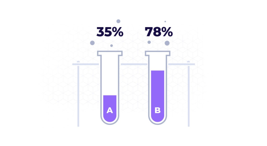
Of course, the best way to improve your conversion rate is to run test. Testing lets you compare different versions and see which is better.
You shouldn’t test random guesses but informed predictions.
You can use analytics to identify areas where you are going wrong. If prospects leave very quickly then maybe your site is loading too slowly or you aren’t grabbing attention well enough. If they spend a long time and then don’t click through, you may need to find a way to address concerns or increase the appeal of your offer.
If you have a lot of visitors clicking through but not converting, then your landing page may not be related enough to your offer or offers.
Use the ideas above and add some rocket fuel and boost your conversion with landing page optimization.




One comment
Landing pages are a key component of online marketing campaigns. Since landing pages are focused on conversions, improving their performance can lead to significant improvements in business results. Landing page optimization can help you lower your customer acquisitions costs, acquire more customers, and maximize the value of your ad spend. I am obliged for sharing those suggestions for landing page optimizations. It will encourage entrepreneurs to work more effectively on digital marketing and gain potential results from it.