
A lander, or a landing page, is a crucial part of any performance marketing campaign. No matter if you run leadgen campaigns, affiliate marketing campaigns or plain old blog that you want to boost, a well-designed landing page is a must.
But with more web users sticking to their mobile phones, your landing pages have to be optimized for mobile if you want to see a good ROI.
But what are mobile landing pages and how should you optimize your landing pages for mobile?
We’ll cover all that and more today.
What are Mobile Landing Pages?
Technically, a landing page is a page where someone arrives at (or lands on) your website. But using this description a homepage is a landing page. In practical terms, landing pages usually refer to something slightly different.
Unbounce describes a landing page as
“a standalone web page created specifically for a marketing or advertising purposes”.
That’s a pretty good description but let’s add a couple of common trends here.
- landing pages receive targeted traffic (paid, direct, email, other)
- landing pages desire a certain action (a sale, a subscription)
- landing pages don’t provide a range of options or content to explore.
With the first description, every website homepage or article could easily be included. But with the second description that isn’t the case.
When we talk about mobile landing pages, we are referring to landing pages for mobile traffic, that is usually smartphones but can also include tablets.
Due to differences in these devices, there are different needs and requirements in these landing pages.
Benefits of landing pages in performance campaigns
Landing pages are perfect for leadgen campaigns or ecommerce product promotions, because they are designed to generate an action, such as:
- Purchase
- Leave contact info
- Sign up for a newsletter
- Go to app store to download an app
- Sign up for a platform demo
Apart from that, landing pages are used to warm up cold traffic. Do you think that anyone purchases an unknown product just from an ad? No. They need to learn about product benefits, technical specs, as well as about your return policy and other things.
But to digest all this information, a mobile landing page has to be well designed.
Mobile Landing Pages Should Still Follow Good Landing Page Principles
Many articles offering advice on mobile landing page optimization will go through many pieces of advice that are equally true of desktop landing pages (For example, use a compelling call to action).
While these principles are true, I am going to focus on what really matters for mobile. You can, and should, research these principles as well but I’m not going to waste your time repeating general points like.
- use good design principles
- use an SSL certificate and HTTPS on your lander
- use effective copy on your landing page
- conduct A/B testing on your campaigns
Instead, this article is focused only on Mobile specific advice.
The 7 Deadly Landing Page Sins: What NOT to Do
Let’s look at the big picture first. There are some classic mistakes which lead to poor performing mobile landing pages. Many of these can equally apply to desktop landing pages but are often worse on mobile landing pages.
Knowing what these sins are can help you stick to the straight and narrow and identify what optimization technique will have the best result on your mobile landing page.
Do you need to atone for any of these mobile landing page sins?
- ineffective copy (true of most landing pages)
- too much copy (phone screen is not great for reading big chunks of text)
- too many options (more than 3 buttons seen at once on a 6 inch screen is too much)
- no images (thousand words…)
- copy that doesn’t relate to the ad or content that brought the visitor to the page (our attention span on mobile is even lower than on a desktop device)
- hindering conversions (long fill in forms)
- slow loading pages (even worse on mobile landing pages)
- designed not considering mobile layouts (side scrolling on mobile – really?)
11 Ways to Optimize Your Mobile Landing Page
1. Speed up your load time
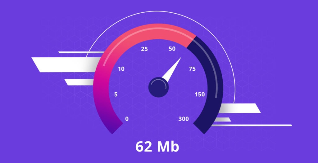
One of the most import things you can do on a mobile landing page is to speed up its load time. While a slow loading webpage is punished by desktop web surfers, it is an unforgivable sin to someone on their phone.
A simple step to improve your mobile landing page performance is to speed up your mobile landing page.
Depending on what technology you use and if you have a specific problem with your landing page then there may be certain steps you need to take (such as using a faster server) but there are some general principles that will help most people.
- Use well-coded solutions
- Optimize your images (more specific advice below)
- Use a CDN (check the tools section)
- Don’t overload your website with content
A. Use well-coded solutions
Poorly coded websites and tools for websites run extra processes and are heavier on a web browser’s rendering engine. Javascript takes more time to load than HTML and CSS, and poorly written Javascript takes even longer to load.
If you get a solution (such as a WordPress theme, plugin or website engine) which doesn’t follow coding best practices then it will be much slower to render.
B. Optimize your visuals
Images contribute a lot to your website load time. They take up a lot more space than text and can even take longer to load than a video does initially, as long as the video doesn’t autoplay or take up the whole page.
The first step to optimization is to be selective in your choice of images.
If you have five images on a page, it will take longer to load than one. Consider if you really need those extra images.
The second step is to reduce the size of your image.
A good CMS will resize your image so it’s more suitable for the website (even if you upload a giant 4000 x 3000px one in the first place), but it’s better to upload a reduced image so you are guaranteed a smaller file is loaded and doesn’t need to be resized by the device.
You can have images which have the same number of pixels, and yet one takes up much less space than another. This is due to a variety of image information that could take up an article on their own.
The key takeaway is to use an image optimization tool that will let you save space while keeping your image quality.
Finally, using a CDN will also help speed up the delivery of images and save loading time. And it can help with the rest of your web page.
C. Use a CDN
CDN stands for Content Distribution Network. Instead of serving a website from one server in one location, it distributes your content across the world.
This means you have less pressure on one server or location and your content will be from a closer location to the request. This helps deliver your content quicker.
You can use a CDN for the whole webpage, or it can be used for elements on the web page such as the image or videos.
D. Don’t overload your mobile landing page with content
The more content you have, the longer it will take to load. This doesn’t apply to text, but more to images, videos, and animated elements. Seeing as one of the good principles of a landing page is to keep to the point and clearly and quickly make your case, this principle is a useful reminder to not add more than you need.
If you find your landing page loads slowly, then look at how many images, videos or animated elements requiring complex scripts you have on the page. Try removing one or more of them.
2. Use Single Columns
Single column design has become more common on desktop pages for articles, but multiple columns are still common in landing pages especially when highlighting key features, benefits or on pricing tables.
In a mobile website, these columns become compressed and difficult to read and press.
Responsive web design usually changes these blocks to cascade on top of each other. While this works, make sure that these elements are in the right order on a mobile page or use a separate mobile landing page.
Alternatively, create a mobile landing page which has only a single column.
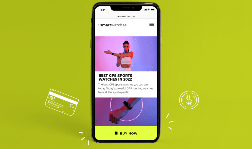
3. Use large CTA buttons
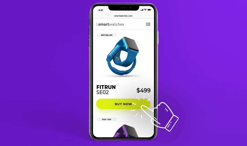
Unlike a mouse pointer, thumbs and fingers aren’t precise instruments. It isn’t so easy to precisely press a button on a mobile device.
If you don’t make your Call To Action buttons large enough to easily press, then you risk frustrating your users.
That can lead to a drop in conversion rates and an increase in cart abandonment when someone does, finally, click on a button.

4. Remember, phones are made for calling
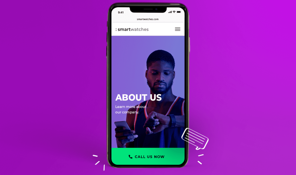
I know this may be hard to believe, but there was a time when the phone function was the most used item on a mobile phone. Yes, now some people will never use the phone app but it’s still there and deeply integrated too. When a webpage marks up a number correctly, it is under a tap away from a phone call.
Don’t ignore the option to get someone through to a phone number to complete a conversion. Some offers are based on Cost Per Call so a mobile focused campaign with mobile traffic landing pages and offers makes a lot of sense.

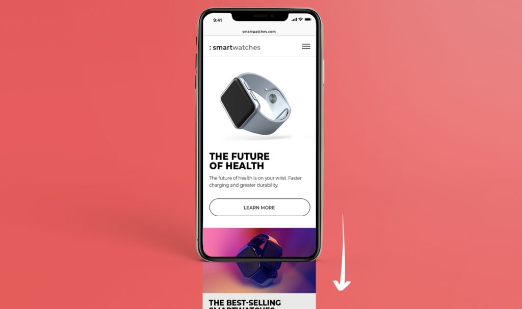
5. Click to scroll
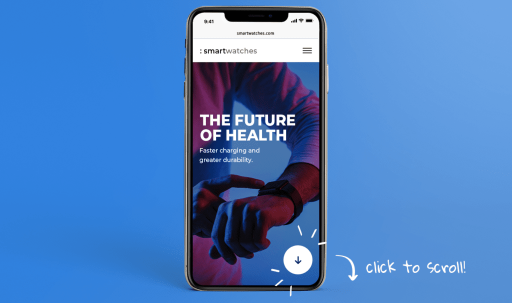
Although users are more used to scrolling on their smart devices, the old adage of “above the fold” still has truth. If it is isn’t obvious that you can or should scroll, you may not. One option to get around this problem is to have a “click to scroll” option (note: this doesn’t have to say click to scroll).
In essence, you want to show that you can find further information by pressing this button. It could start scrolling a user down the page or take them to a page with further information.
Even if you choose not to use this option, make sure there is a visual cue that there is more content or you can scroll.
6. Sticky headers (and footers)
A sticky header is when the top part of your page is always visible even as you scroll. This lets you constantly show a call to action to a landing page visitor as they scroll through more information.
A sticky header provides an easy way for a visitor to convert once they have been convinced.
This is important for mobile browsers as returning to the location of a call to action button can be problematic.
7. Use Geo-targeting
Location is even more important with mobile browsing and devices as users are more likely to be on the move and to value local information more.
Mobile landing pages can have dynamic elements which will adapt to the user’s location.
This could be as simple as changing the headline to include the visitor’s local town or city, to showing the closest store to the user.
This can help users trust a site as it is more relatable to them, and it can provide easier conversions. You may be happier to purchase an item if you believe it will be delivered quickly. If you see it is from a different country, you might keep searching.
8. Not all screen sizes are equal
Just because someone is on a mobile device, it doesn’t mean that their screen size is the same. The difference between an old iPhone screen and a 4k ultra high-definition android screen is vast.
If you optimize for the latter and don’t check the former, your design might not be effective or even usable.
9. Don’t use too long forms
It’s a fact that on any landing page, mobile or desktop, if you increase the number of form fields you have to fill in, conversion drop (with very few exceptions). But with mobile, the result is far more pronounced.

It’s much harder to fill in forms on a mobile phone as the keyboard is less easy to use, and it’s harder to move between fields.
If you require a larger amount of data, there are two tricks you can use to prevent a reduction in conversions.
A. Give a helping hand with autocomplete
If you set up a web page properly by correctly marking your fields, then a user will have auto-complete options. This saves time and effort for the user and the might not even have to type anything. They just let their device fill everything in.
B. Two-stage opt-in
You might be able to split your opt-in form across two stages. The first should contain the absolutely vital information you need, the second can request further information. Once we start down a funnel, we create a sense that we should finish (we’ve already “voted” with our actions that this is worth doing).
By splitting the steps up, it can make the whole process feel less overwhelming as each step is small. And if a user fails to complete the second step, you will have their contact details to follow up and get that conversion.
If you combine these two tricks, then multiple form fields is far less threatening.
10. Use bullet points instead of long sentences
If you have a group of criteria, features, or benefits, then you should consider using bullet points.
- They save space
- They are easy to skim
- They catch attention
11. Or accordions to save valuable space
Accordions are expandable sections on a webpage which are condensed by default. These can be very effective to provide further information while not making the webpage seem overwhelmingly large.
One way to use accordions is for FAQs. The accordion can show the question and with a tap, it expands to reveal an answer. Very useful for overcoming objections.
Tools to optimize your Mobile landing page
There are some great tools on the market that can help you optimize your mobile landing pages. These range from all-in-one tools which help you create a complete, optimized landing page to those which help with one specific aspect of your landing page optimization.
1. Mobile Landing Page creators
As previously mentioned, there is a selection of landing page creator platforms that aid in the construction of effective landing pages for both mobile and desktop.
These services usually provide templates and hosting for your pages but they may also integrate with email services, CDNs (more later), stock photo services and offer unique features to enhance your landing pages.
Some examples of services include
2. Tools to reduce the size of images
Reducing the size of your images can help speed up your landing page. You can find these tools in a range of forms depending on your needs.
- standalone applications
- plugins for photoshop
- plugins for WordPress and other CMSes
- website and API services
Depending on what other tools you use (and your privacy concerns) you may choose one over another.
Tiny PNG offers an online service, Photoshop, and WordPress plugin as well as an API which makes it a great option to consider no matter what your exact needs are.
3. CDN
A Content Delivery Network is a collection of servers around the world that each store a copy of a webpage or individual files. By providing distributed delivery of resources, content can be displayed faster and with a reduced risk of overwhelming your servers.
4. Landing Page speed testers
You should carry out tests to make sure your mobile landing page is running and loads quickly.
A good tool will show you not only the loading speed, but also what is making it load slowly.
Pingdom offers a great, free speed test tool that will let you see what is slowing your landing page down (and it works on desktop pages too).
5. Landing page content testers
Varvy.com offer a mobile SEO test. This checks how your page performs in a variety of factors that include the speed it loads but also includes readability and analysis of tap targets. This is a great tool to run your site through to make sure you have optimized correctly.
Get to work optimizing your mobile landing page
With all that covered it’s time to get to work and increase your mobile conversion rates. Identify the areas which could improve your mobile landing pages the most, and start making changes. Remember to test and use Voluum to make sure your improvements bear fruit.


 Facebook
 Telegram