When you have a lot of information to consider it’s hard to make a good purchasing decision, right? It’s pretty obvious and yet so many companies and adverts overwhelm their audience with information in the hope that something will help convince them to buy.
They have failed to consider cognitive ease in marketing and the way our brains work, but by understanding a few simple aspects of the brain you can make your marketing campaigns far more effective.
Cognitive ease
As I mentioned, our brains want to make easy decisions. The more they work the harder it is to make a decision and — importantly for marketers — the more cautious we are. If a decision is easy for us, then we are happy to go along with our gut instinct.
But at a certain level of difficulty, a decision requires our deliberate thoughtful consideration. At this point, we will either give up or need far greater evidence to be convinced.
There are a lot of factors that can help create cognitive ease, but let’s address the other side first, factors which can increase your cognitive strain.
4 Factors which reduce cognitive ease
1. Bad writing and confusing messages
One of the easiest things you can do to improve your marketing is making sure your writing is clear and easy to understand. Using complicated grammar and words may make you feel good about yourself, but if your reader has to read a sentence a second time to understand, then you’ve lost.
Use simple, clear language and easy to understand messages.
2. Too many choices
This has been called the paradox of choice, it basically means that we usually want more choices, but we find it harder to make a choice when we do have more options. We start feeling overwhelmed and so we actually would rather have fewer options but we wouldn’t say that.
When Steve Jobs rejoined Apple he famously simplified their product line to a simple four options with two variables.
- Do you want a laptop or desktop (Mac vs MacBook)
- Do you want a consumer or pro option (regular or pro)?
Admittedly, he added other options later but it certainly helps you know which option to go for.
For you, this means that you shouldn’t overwhelm a buyer with too many different offers at one time, and if you do have a wide range of choices, try and guide the user to fewer options.
For example, New Balance have filters based on casual or sports shoes, if you select sport they then have options for running or general exercise. This helps reduce the choices for the user to consider.
3. Too many steps
Every time I buy an airplane ticket from a budget airline I come across cognitive stress. Just when I think I’ve got to the end, there’s something else to do. On a couple of occasions, I’ve left the purchasing process to look for other options again.
This is a problem of too many steps.
By removing steps in a purchasing process (even simple things like filling in customer details) you help avoid cart abandonment.
Now, that doesn’t mean you should never use any landing pages or multiple steps in a purchasing process, but you should have as few as you need and not a single extra.
4. Unfamiliarity
Have you ever come across a door with a handle that looks like you should pull on it, but instead you should push it? It winds me up every time and this is a great example of unfamiliar design.
When things are familiar, we know what to expect and so we have a greater cognitive ease, but when things are unfamiliar, using different design ideas or unexpected twists, we have to use more mental energy.
Click here to learn more about making your design irresistible.
2 Ways to use cognitive ease to increase sales
Once you’ve stopped creating extra cognitive barriers, you can start using more neuromarketing techniques to provide cognitive ease to help users make a purchasing decision.
1. Priming – teach someone before they buy
Priming is when you make someone more open to your offer or idea by suggesting ideas beforehand. This can come in many forms, some of which are simpler than others.
One of the simplest forms is by using words and language similar to the action you want the person to take to make them more receptive to the idea. This is a classic element of basic hypnosis where the words you use start to make people feel the way you describe.
By using words connected to feeling tired you make someone feel more sleepy.
For example, calling your email list “the action list” because you want people to take action and you introduce the idea that they should take action when they sign up. This of course not only works for signing up but when they are presented with offers later.
Priming, however, isn’t limited to the word and sentence level, we can prime at the concept level.
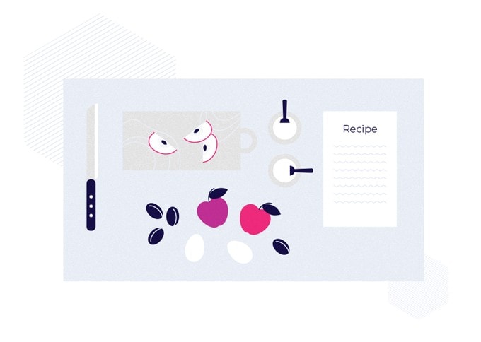
Does your supermarket ever hand out those recipe cards which show you how to cook something? Did they also include a list of product from one brand or from their store? That’s priming. The idea is simple, prepare someone to like your brand by teaching them first.
Let’s say you have some health-related products, you could “prime” potential customers by teaching them about health issues and demonstrating how your products help with that issue.
If you teach them useful information, then you are seen as an authority and you can show how your product or service helps.
In our recipe example, the supermarket primed you with wanting the tasty meal they demonstrated. Now you are receptive to their products, even if other brands and products are better.
2. Anchoring
If I told you the average Parker Pen costs more than $200 dollars, how much would you think a good quality pen costs?
Chances are that you said a higher number than if I had asked you how much a good quality pen costs without giving you that number before or if I had told you that the most popular Parker pen costs only $12. This is anchoring in action.
Anchoring is where you use a comparison to change someone’s perception of an object.
In our example above, I used some statistic to influence your expectations towards the price and quality of this product.
This doesn’t just work for prices, it can apply to many other areas including simple things like colors. The same color next to something white appears brighter, than when it is next to something dark. You can use this to make objects appear more vibrant and attractive.
You may also want to avoid anchoring, for example, if something isn’t as good as another, then you probably don’t want to draw comparisons.
That’s why you never hear or see Apple comparing their tech specs to other smartphones, they are usually lower numbers. But they will compare their new phone to last years model and show performance stats that are higher than competitors.
Anchoring is related to cognitive ease as we can help provide a relevant, and favorable, comparison for a potential customer to help aid their thought process.
Cognitive dissonance
Cognitive dissonance is related to cognitive ease but isn’t the same. It’s basically why people will say one thing and yet do something very different.
For example, people who say that smoking is bad and yet they still smoke. Cognitive dissonance is the process that occurs that makes us excuse these action.
We will think of various reasons, some of which make little sense at all, for why it’s okay to break our rules.
It’s also why political supporters will excuse terrible actions people in their party do and refuse to praise the good things that people in another party do. They may even make completely conflicting statements based on if they are talking about their side or the other.
But what does this mean for advertising and what has it got to do with cognitive ease?
Remember how our brains want to avoid thinking too much? Well, cognitive dissonance causes us to feel uncomfortable and spend a lot of time trying to resolve the conflict.
We can use that discomfort to encourage behavior which doesn’t cause cognitive dissonance and provide explanations to help resolve those conflicts.
1. Avoiding cognitive dissonance
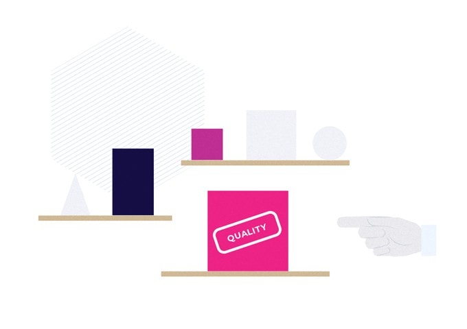
If someone clicks on an advert which asks if they care about quality, then you give two options, one of which describes itself as being “top quality”, guess which people are more likely to pick. If they don’t pick the “quality” option they have to say they don’t really want quality and that’s cognitive dissonance.
Choice selection bias also comes into effect here, whereby if someone chooses something, they will value it more due to the act of selecting it. Choice selection bias does require a decision to be made such as selecting “quality“, but cognitive dissonance occurs just from the statements we make.
This is also why once someone has entered a purchasing funnel, they want to continue to validate their first step. Obviously, there are limits here, otherwise, everyone who clicked on an advert would convert and there would be no cart abandonment, but when we highlight the logical action, we can encourage them to continue.
2. Provide cognitive ease
Let’s use a real example. Someone who says they want to get fit, but never works out.
There are a million and one excuses they might offer for why they don’t which probably go something like this
“I’m too busy, I’m not that unhealthy anyway and I will start tomorrow.”
We could challenge these statements but we may well face a lot of backlash with statements like “sure that’s fine for everyone else but I’m really busy.” Instead, we can offer an easy answer or alternative path.
By the inclusion of cognitive dissonance in marketing, we can acknowledge they care about getting in shape but are busy and so offer a simple plan that will work with their busy schedule. This doesn’t push against their cognitive dissonance but instead works with it and helps to resolve their conflict.
You can use cognitive stress to your advantage
Although it’s generally a good idea to make it simple and easy for potential customers to go through your advertising material, you can actually use these stress points to help people pay more attention to that moment.
These will then stick more than other options.
An example of this might be a quiz for customers where they have to choose from different questions and then have an offer based on their answers at the end.
This also uses choice section bias and cognitive dissonance to our advantage as they chose this item and not selecting the recommended option would go against what they previously said.
Conclusion
By making our messages clear and simple we avoiding getting in customers way when it comes to sales, but we shouldn’t stop them. By using cognitive ease and even cognitive dissonance we can help aid potential customers and clients to make a purchasing decision.
These will never override their natural desires but can certainly see a higher ROI.
Key Takeaways
- Cognitive ease is important for marketing as it makes decisions easier for customers
- Keep your language and messages clear
- Make sure your interface is easy to navigate
- Don’t provide too many options, use filters when you offer a wide range.
- Prime customers to be more open to your products
- Use anchoring to change customers perspective
- Use customer selections and answers to provide specific suggestions


