
A high-converting landing page is essential for driving sales, generating leads, and building customer relationships in online marketing.
First impressions do matter – also in the programmatic digital advertising landscape, where advertisers are constantly fighting for web users’ attention. That’s exactly why a well designed landing page is an excellent performance marketing tool to drive direct sales, generate leads and build strong relationships with users.
By delivering valuable information through landing pages, advertisers are given a chance to shine a spotlight on their product, highlight special deals and answer many of the questions potential customers may have. Result? Much higher conversion rates and better lead quality.
Well, if you’re new to online marketing, you might be wondering what landing pages or their main components are. No worries, we’ll start slowly (promise!) and learn the basics, then gradually progress and share with you some of the best practices on how to create a high-converting landing page.

What Is a Landing Page in Digital Marketing?
Also known as a squeeze or splash page, in digital marketing a landing page is a single website where a net surfer “lands” after clicking on the ad or the link within it. Definitely, it’s one of the key elements when it comes to creating a high-converting digital advertising campaign.
The main purpose of the landing page is to convert cold traffic into valuable and high quality leads. In contrast to typical websites that usually encourage exploration, great landing pages are designed with a single goal in mind: each element on the page, starting from the headline to the CTA button helps convince web visitors to take a specific action.
What Are the Most Effective Types of Landing Pages?
Actually, there are plenty of different kinds of landing pages as each of them serves a different purpose in a different business. For conversion-focused marketing campaigns there are four predominant types of landing pages that perform best:
1. The Opt-In Page
Designed to convert users into subscribers with the help of a lead magnet. Basically, the main purpose of the opt-in landing pages is to gather contact information from the visitor, usually focusing on their name and email address. People who land on this web page can opt-in to signing up for a newsletter in exchange for downloadable content such as an e-book, free trial, recorded webinar, or guide.
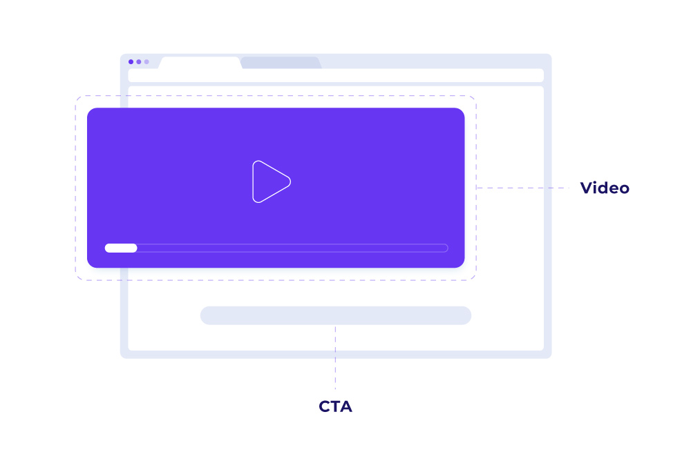
2. Video Page
As you could guess from the name, this landing page type centers purely on the video. Hence, in many cases the background of the web page is blank. Sometimes even the play and pause buttons are removed, so only after a video ends, a web user is redirected to a download or a sales page. Definitely, video format is far more engaging than plain text or even images. Plus, as there are no distractions, people who consume such content are likely to convert much better.
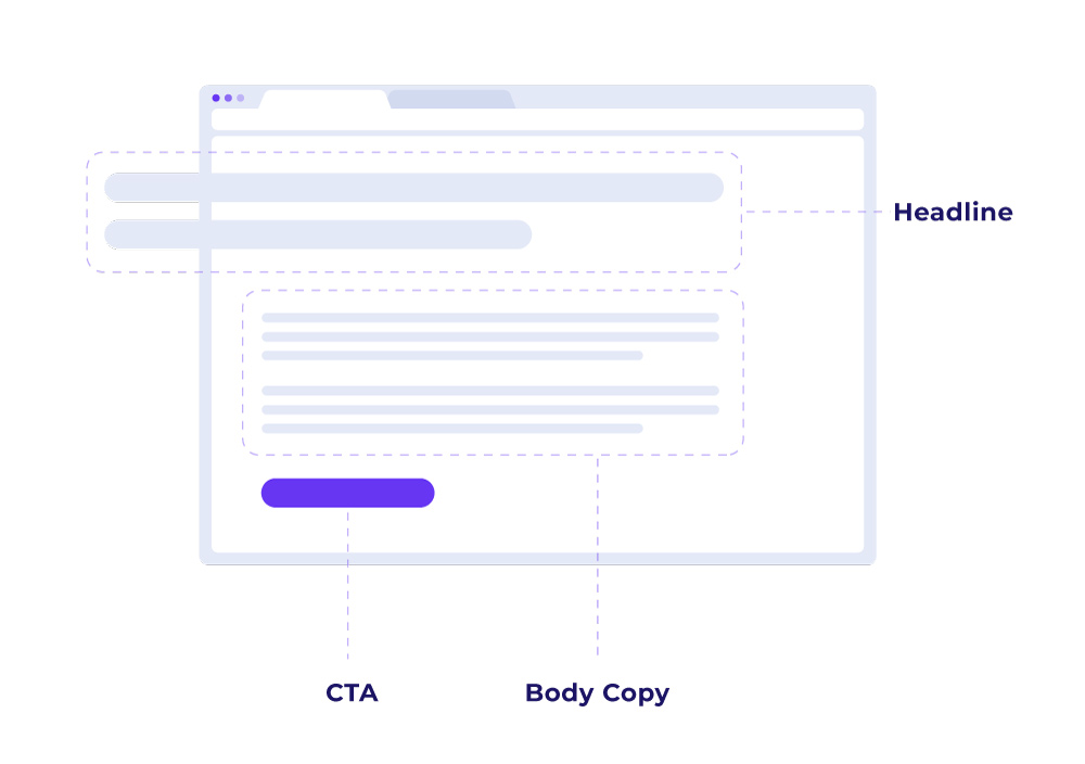
3. Long-Form Sales Page
Long-form sales pages rely on a heavy amount of written content (very often 8,000 -10,000 words or even longer). They answer every question that potential customers may have and highlight every single benefit that the product will bring. Sounds overwhelming? Good body copy means good storytelling, and good storytelling will make people read even 20 pages. When done right, long-form landing pages capture attention like nothing else.
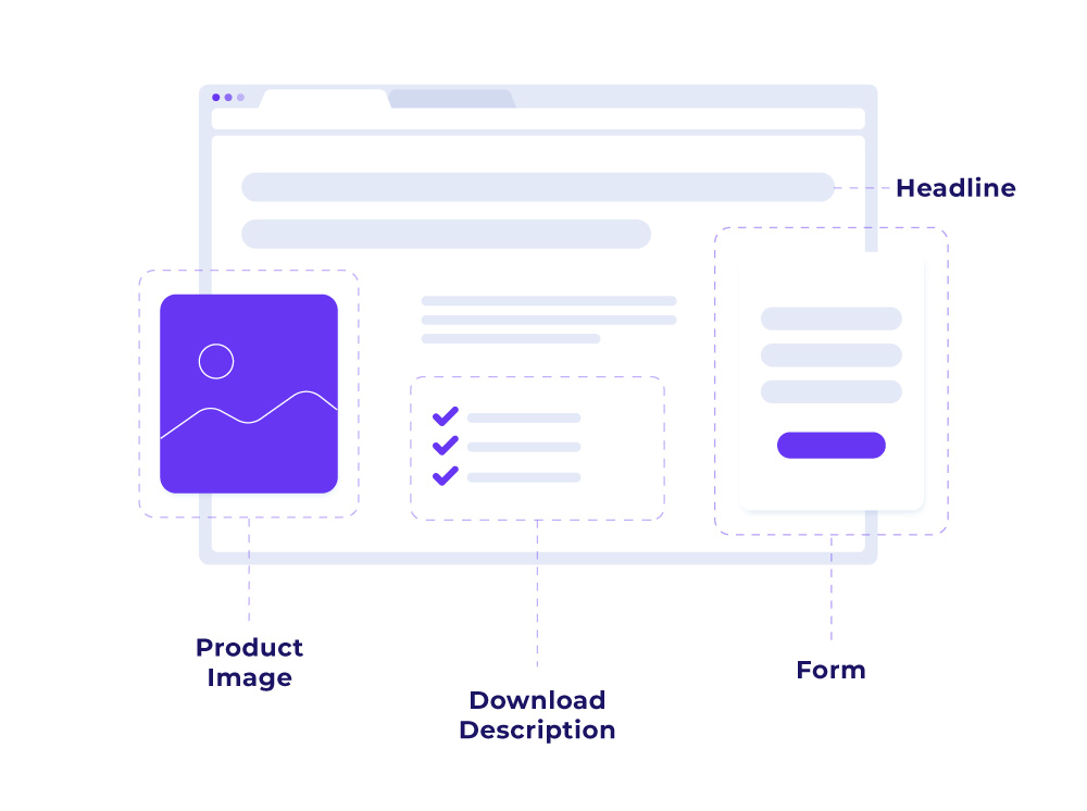
4. Product-Detail Page
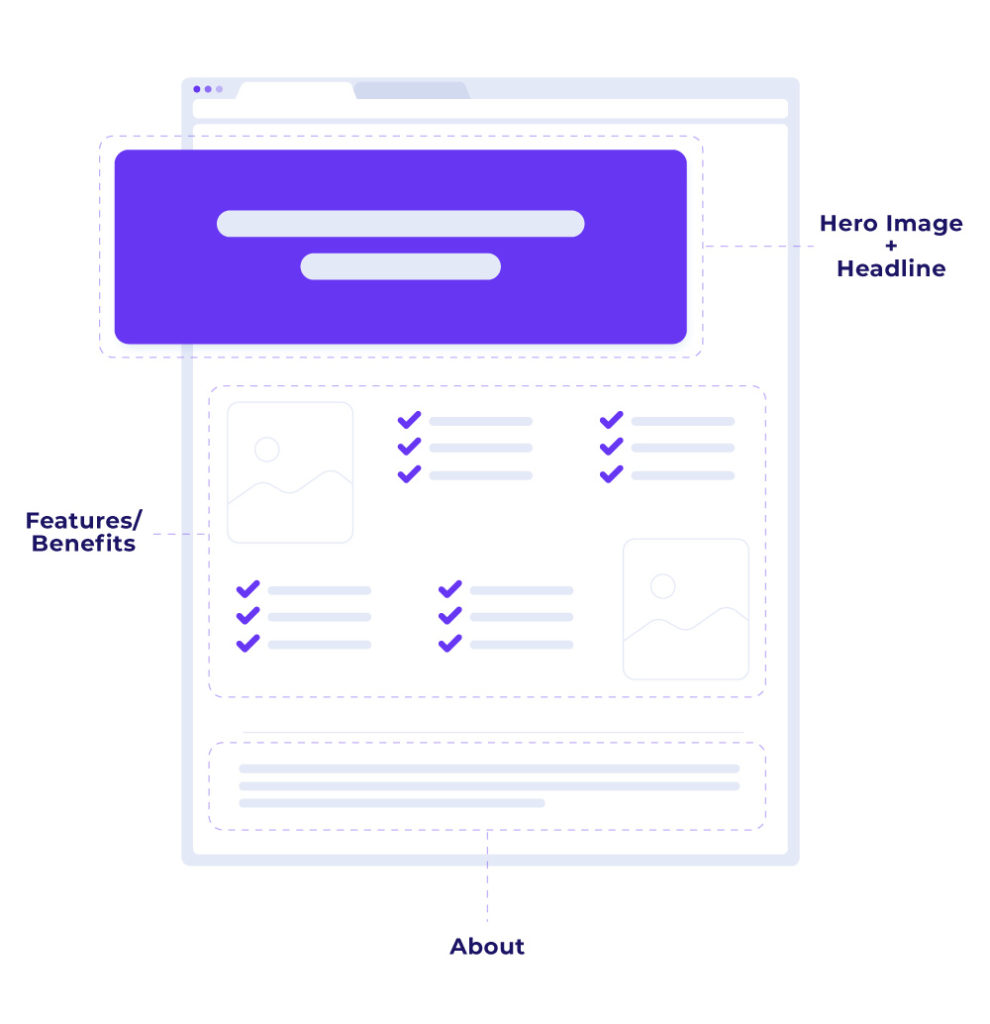
Last but not least, the most flexible type that houses all the information related to the product together with some social proof – product-detail landing pages. Such pages not only give the complete idea of what the product is, but most importantly show off its features and design visually. Thanks to the presence of testimonials, user reviews, or “featured in” sections, they remove all doubts or fears potential customers may have and in fact boost lead generation and landing page conversion rates.
Now that you understand the general concept you may be wondering:
What Are the Key Elements of a Successful Landing Page?
Good question! Many advertisers fail or forget to include some of the basic fundamentals when crafting their landing pages. Each of these building blocks has a set of key factors that can impact the conversion goal. So, it’s time to closely examine one after the other and learn what makes an effective, high-converting landing page design. Let’s take a look!
How Do You Write a High-Converting Headline for a Landing Page?
Can you imagine a blog post or a newspaper article without a headline? Not really, right? It’s simple – headline is the first thing visitors see when they land on a website. If it’s not compelling, customers might bounce immediately to another site. That’s why it should be short, sweet, and easy to read at a quick glance.
Basically, there are four main approaches that you can take:
- “How To” – start with the question and then finish by presenting a solution to your visitors’ problem.
- Pop a Question – ask a question using a headline and then answer it in the subheadline or main copy.
- Highlight your UVP (unique value proposition) – set yourself apart from your competition by giving a powerful reason to choose your product or service.
- Get a Laugh – just be funny, believe me it can be a real game changer. Well, only when it’s appropriate.
Why Is Visual Content Essential for Landing Pages?
A picture is worth a 1000 words, or more! To be precise, the human brain processes images 60,000 times faster than text. That’s why no landing page is complete without some relevant imagery. Not only does it help to deliver information, but also captures users’ attention and lowers bounce rate, making the offer more exciting.
Generally, consumers that arrive on your landing page are trying to solve a challenge. Hence, most advertisers take advantage of the following visuals:
👉🏻 An illustration of the solution
👉🏻 An illustration of someone using the solution
👉🏻 A video of how to use the solution
In any case, it pays off to invest in original photos and images. Stock photos are used by thousands of other businesses and can be spotted a mile away. You don’t really need detective skills to see how generic and impersonal some of those images are.
Not all stock photos are bad, though. If your budget is too low to invest in your own photoshoot, just look for some little-known websites with more original and trustworthy visuals.
How Do You Write Persuasive Copy for Landing Pages?
Yes, images are the key but they don’t work alone. Therefore, if they are not supported with the right words you will not see many conversions. Your copy should highlight USP and describe why your offer is superior and solves the viewer’s problem better than the competition. Using different formatting techniques, like bullet points or bolded words can definitely help you get your point across quickly.
On top of this, your description should be readable and customer-centric so that it speaks directly to your viewers. In fact, using artistic fonts might look stylish, but if your prospects struggle to read the copy, the messaging together with the chance of conversion will be completely lost. Besides, keep in mind that by using words like “your” instead of “our” you will make your offer more personal and less generic.
How Can You Build Trust on a Landing Page?
Customer’s trust is everything. Adding statistical evidence, trust badges, contact details, or privacy policy to your landing page can help you make it look more credible. Not to mention social proof – the online version of word of mouth. A short quote from a subscriber or a satisfied client can not only earn users’ trust, but also help your audience make a decision faster.
How Do You Create an Effective Call-To-Action for Landing Pages?
Creating the most enticing CTA button is key for an effective landing page. After all, that’s what gets you more leads and drives your sales. A killer button has three main elements: the right colors, the perfect size, and the compelling copy. You can test different variations, but in most cases keeping it clear, actionable and short will do the trick.
When deciding where to place the button, keep in mind the flow of UX and reading. Make sure you don’t put it too prematurely on the page as you risk losing conversions. So, start with explaining your offer, describe how to obtain it and then display your CTA.
Plus, remember to leave a healthy chunk of white space around the button. It reduces distractions and increases the probability of interaction at the same time!
How Important Is Mobile Optimization for Landing Pages?
Currently, mobile optimization is table stakes for any website, also your landing page. Based on the study in this day and age around 52% of the overall web traffic comes through mobile phones. So, don’t wait any longer and make responsive design a major priority. Your landing page should be mobile-friendly, so that all the users have a high-quality experience, regardless of which device they’re using.
How Can You Measure Your Landing Page’s Performance?
As long as you’re following the best practices covered above, you’ll most likely be on your way to turn your landing page into a lead-generating machine. As you can see it’s not rocket science. You can always consider using a landing page builder tool that even more simplifies the process.
But, how would you know if your website actually rocks? You need a way of measuring your page’s performance – and I’m not talking about website health monitoring tools (but you should also look into them as well). I’m talking about a tool that would provide you with trustworthy and detailed information about how many people have visited your site and what their characteristics were.
This tool should also enable you to easily conduct A/B testing and experiment with different landing page versions. Voluum offers robust A/B testing capabilities, helping you identify which page variations deliver the best results for your campaigns. The most reasonable approach is to test two variants of the page, original and changed and observe which one is getting more traction.
Finally, you need a tool that can automate routine activities, provide real-time alerts for campaign issues, and simplify ongoing landing page optimization. Voluum automates these essential marketing tasks, letting you focus on driving conversions.
In short, you need the Voluum tracker, a go-to tool for performance marketers and native advertisers that need to perform large-scale optimization.
Frequently Asked Questions
Question: What is a landing page in digital marketing?
A landing page is a single web page that users arrive at after clicking an ad or link, designed specifically to drive a particular conversion action such as a sale, signup, or lead submission.
Question: What are the most effective types of landing pages?
The most effective types include opt-in pages (to collect leads), video pages (to engage users), long-form sales pages (to answer all customer questions), and product-detail pages (to showcase product features and testimonials).
Question: What are the key components of a high-converting landing page?
Essential elements include a compelling headline, relevant imagery, persuasive copy, trust indicators like testimonials and privacy policies, a strong call-to-action, and mobile-friendly design.
Question: How do you know if your landing page is successful?
Success is measured by tracking visitor behavior, conversion rates, and A/B testing different versions to find what resonates best with your audience. Tools like Voluum offer detailed analytics and performance automation for this purpose.
Question: How can Voluum help improve your landing page results?
Voluum enables advanced campaign tracking, easy A/B testing, and automation of optimization tasks, helping you quickly identify and implement winning landing page strategies.


