There’s not a lot you can’t sell online. The problem lies in advertising your ecommerce store in a way that ensures even the craziest inventory gets noticed and attracts customers.
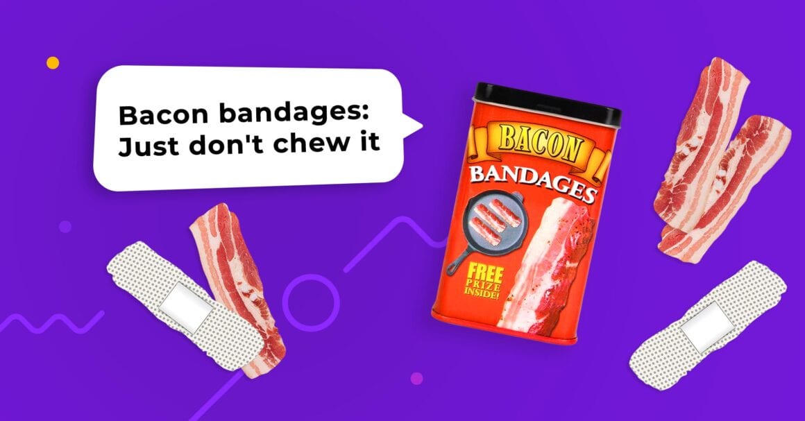
Bacon bandages are far from the craziest things available online.
Ads for ecommerce stores differ from brand ads, sweepstake banners or push ads from a mobile ad. Their job is simple yet extremely hard at the same time. Ecommerce store ads need to:


Sounds easy, right? Just show how awesome bacon bandages are and you’re done.
I’d purchase it straight away!
But, hear me out, what if your product is not a funny gadget that everyone secretly desires? In that case, you really need good ads and a clever advertising strategy.
We’ve already covered the topic of optimizing your ecommerce store. Now we will focus solely on ad design.
And shoutout to all those people that clicked this article purely because of the beautiful header image!
Ads for Ecommerce Store Design Principles
Creating a stunning, eye-catching and engaging ad is a challenge for marketers and graphics designers but for different reasons. The latter will have less problems in figuring out the visual part, but the former may have a better understanding of what message this ad should convey.
So, to help them both out, we’ve prepared a list of ecommerce ad design principles that will drive hot traffic to your products.
1. Interactivity
First things first: nowadays, ads are so much more than just nice images. They can be videos or even have interactive elements that include everything from rotating images to whole mini-games or questionnaires.
Embrace those formats!
This point strongly connects with the next one but let’s address things one at a time.
Interactive ads for ecommerce stores stand out, are more engaging and, apart from that, can cleverly tie to your product.
- Use rotating or carousel-style ads to show ‘Before’ and ‘After’ effects or to show a wide view of your product (for example: car interior)
- Use quizzes and questionnaires to tell users that they may need your product. For example, you can ask them a few questions about computer safety to market your PC protection software.
- Ads that simulate depth or perspective through parallax shift single out your product in an attractive way.
Don’t worry if you don’t have the design skills to create such ads. There are interactive ad-builders available out there that will get you a cool ad after 15 minutes of work.
2. Value exchange
The most powerful social mechanism is reciprocity. Give something to users and they will give back their attention, a couple seconds of their precious time, and maybe even a few bucks for the product you advertise.
What would be your value? It’s not your product, which is part of a separate deal.
What you can provide to users is:
- Interactive experiences, using the novel ad formats that we have discussed above
- Exclusive deals that are only available through this ad
- Free goodies like currency in a mobile game, desktop wallpapers, ebooks, reports, whitepapers, and guides.
- If you can manage it, personalized information (Spotify’s Wrapped is a good example) that includes usage statistics in a mobile game, security or health reports
Communicate this value in your ads for ecommerce stores and you may see engagement rates far exceeding those that would have come from simple “Hey, this is my product” ads.
3. Context matters
Ads for ecommerce stores don’t appear on blank spaces on the Internet, they are surrounded by a given context, which defines not only aesthetic choices but also users’ expectations.
You can meet these expectations or subvert them. Mimic the surrounding context or try to stand out. But you always should be aware of where your ads appear.
On Facebook, people may not expect or even like shopping ads that much. Use CTAs that don’t suggest that you want to sell them something.
Use CTA texts like “View now”, “Learn more” or better yet: “Get directions”, “Learn how to save”.
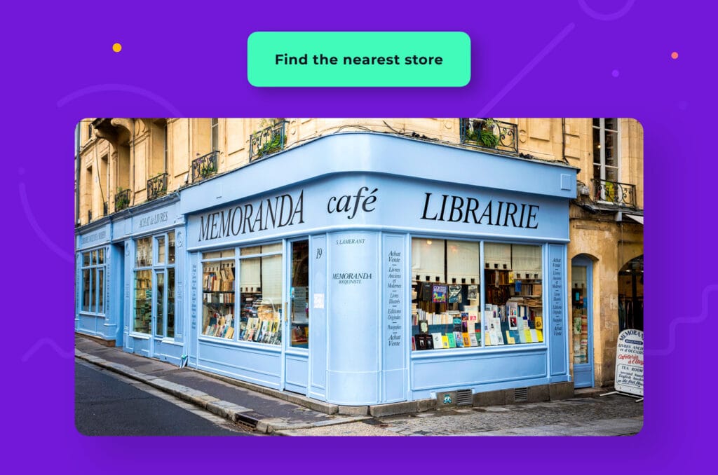
Show maps to the nearest store or to virtual dressing rooms. You don’t have to sell things straight away. Warm people up to the idea that they really need your product.

4. Design stunning creatives
You are not trying to win any photo contests; you’re trying to showcase your product. Forget all those tips from YouTube tutorials about framing, perspective, etc. You have seconds to catch someone’s attention, if you overdo your product’s photo, put it in front of a colorful background, use weird angles or other photography tricks, your picture will be just a blur for an eye that quickly scans the content.
If you sell pots – there is nothing wrong with a plain picture of a pot on a nice background. You can use gallery-type ad to show more photos and present your pots in a kitchen environment. But the first picture should have an easily distinguishable outline that takes less than a second to recognize.

5. Add something special to your creatives
Sometimes just advertising the product itself won’t cut it. No one will be convinced to buy contact lenses just by their photo. They could be convinced by a close-up photo of eyes wearing them.
Or maybe you want to stand out from the crowd with your product. Or maybe its benefits aren’t clear and you want to show them straight away.

There are a number of reasons why you want to show something more than a plain product photo. Here are some ideas for spicing up your photos:
- Include faces, especially when actors or models look directly at the camera. We are naturally drawn to faces and examine photos with them for a bit longer.
- Use diagonal lines or blur effects to suggest motion. This is especially useful for products that move, like RC toys.
- Use photos made by your happy customers (you have to ask for permission to use them, obviously). They most likely will have an amateurish-vibe to them, which will give your product some credibility.
- Add a funny twist to your creatives: include best (and most original) customer reviews or pictures of your product used in really original and untypical ways
6. Keep your messaging consistent
You most likely use more than one advertising channel to put your message out there. Or even if you are solely Facebook-focused, you also use advertising images on your store’s web page.
Make sure that you provide consistent experience to visitors:


You don’t want your visitors to feel kind of cheated, when your ads for ecommerce stores are all jolly and funny, but your store page is 100% dead serious.
7. Use ads to address any concerns
Headlines can be used not only to sell the product itself but also to address any doubts and reassure the prospective customer that they can try your product risk-free.
Include information about:
- Return policy with headlines such as “Try for 90 days and return no questions asked”
- Product guarantee
- Free delivery
- Payment options, including delayed payments (BNPL, buy now pay later)
I know that crafting a catchy headline that includes this boring information sounds hard but trust me: there’s a limited number of things you can do with words having such strict character number constrictions. Sometimes it is better to be to the point with serious information than clever but repetitive.
8. Talk to your model customer
I’m pretty sure that you have discussed your buyer’s persona many times either with yourself or with your other team members. This is marketing 101.
But have you considered addressing them directly in your ads for ecommerce stores?
“Hey, you – IT guy or new media professional from a big city – get an electric scooter”.

Maybe that’s a bit too on the nose. But speak in the way that your ideal customer understands. Use inside jokes or hermetic language.
Even two identical ads posted on Facebook may have dramatically different impacts on users simply because of different engagement metrics. A post with 1.5 thousand likes is much more trustworthy than a similar one that has only 3 (not thousand) likes.
Try to generate a post that can spark engagement (in a good way).
It’s easier said than done, I know. And a general rule would be: it’s better not to overdo your ads, things may not sound good in various contexts and by various people. You don’t want to be the subject of an angry online mob.
But if you feel confident – go against the trends.
Patagonia, a producer of outdoor sportswear, had famously told people not to buy their jackets on Black Friday.
Do you feel intrigued?
I know I was.
Measuring store visit metrics is an industry standard. With an ad analytics tool like Voluum you can measure the performance of various marketing channels: Facebook, Google, ad networks or email marketing systems, see them within one dashboard and even pass conversion information back to these platforms.
10. Try different approaches at once
You can, and you should, prepare several ad variations and see which one gets the most traction. I’m not talking about designing two different marketing campaigns from scratch. I’m talking about ads that are consistent with your brand and messaging but differ slightly in the angle.

These ad variations can highlight different aspects of the product or have different CTA variations.
Measure their performance with Voluum to see what clicks with what kind of audience. With Voluum, you can get detailed information on the device types, locations, even web browser versions used by your audience. Stop the less performing ad or display it only to the parts of the audience that responds to it well.
Good Ads Sell Good Products
The perfect ad will sell a lot. But don’t get me wrong, an ad is an important, but not the only element of a working funnel.
Apart from ads, you should have a good store page, supply chains, customer support, marketing strategy… and yes, a good product.
These are the parts that make successful sales. If you want to advertise it on Facebook or Google, we have guides on that.


