
Just as everyone judges books by their covers, the web design you use has a big impact on not only how people perceive you, but also the effectiveness of your affiliate marketing campaigns. Luckily we can glean design principles from psychology to make our advertising campaigns much more effective.
Now at this point I should mention that we could literally write a whole book on this topic, in fact, there are whole books written on this very topic so this will not be a conclusive post but instead it will focus on a few simple but useful tips that can help you get more out of your campaigns.
1. Fonts and typography
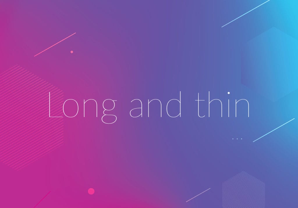
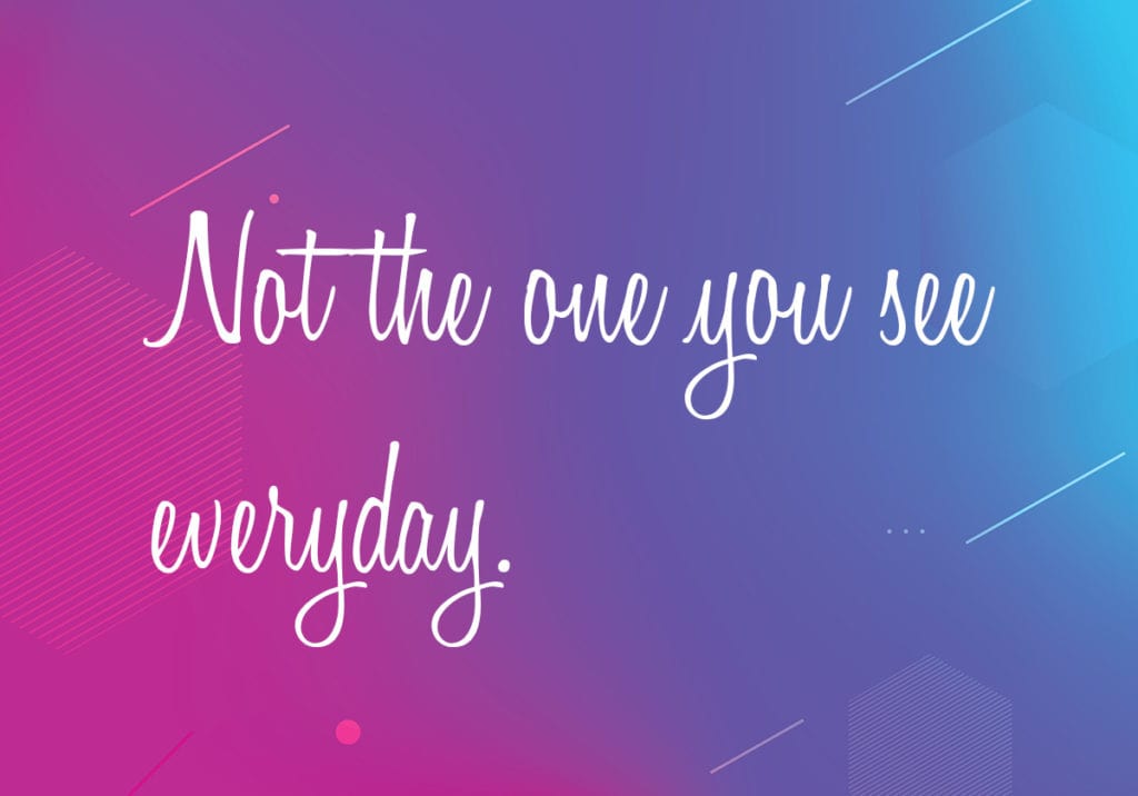
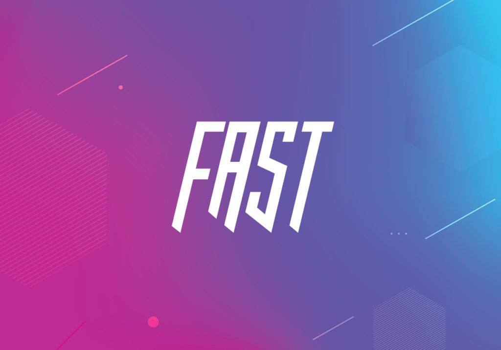
Take a look at the fonts below. How do they make you feel? What type of adverts and markets do you think they’d work better in?
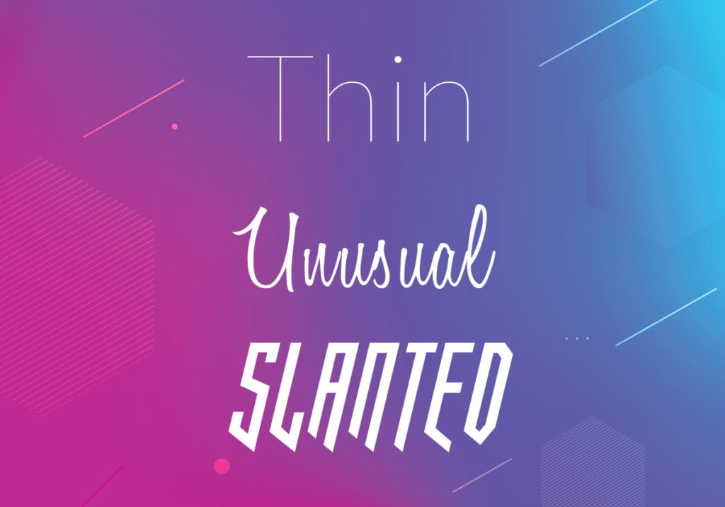
Long thin text works better for beauty as they mimic the features people tend to look for in beauty, long and thin.
Using unusual and uncommon typefaces will help suggest that you too are more unique and special. Great for old-timey, boutique items.
Slanted text looks faster, of course. It’s the idea that it’s moving as it’s not straight.
2. Colors
What color do you think of when you hear the word anger? What about calm? Chances are that you said red for the first and either green or blue for the second. That’s because we associate certain colors with certain emotions and ideas.
This can be important in advertising (and in affiliate marketing campaigns) if we want to elicit certain responses. If we use a suitable color that matches our product or advert, then it will help reinforce our message. Using the wrong color can lead to confusion.
Check out this infographic for a basic summary
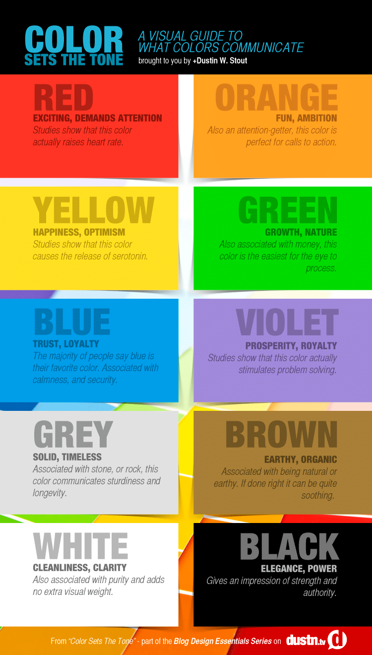
What are the key takeaways? Red and orange are usually the best colors for calls to action, blue is great for brands who want to show loyalty and green is associated with money. Use these colors to invoke responses in the people who read your ads.
3. Proximity effect
Look at these two pictures, which people have a closer relationship?
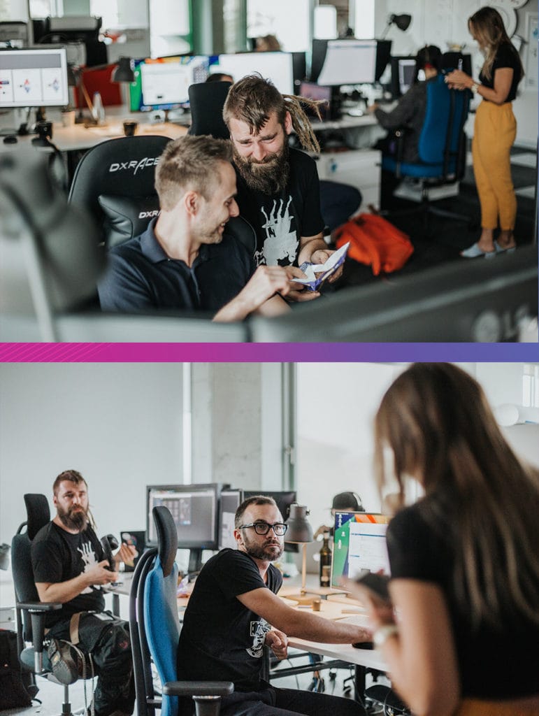
I’m sure you went for the first picture because they’re standing closer together. But that doesn’t guarantee they are actually closer, there can be other reasons why they are next to each other. This is the proximity effect where we link items that are closer together and it doesn’t just apply to people.
If you see two items close together, then you more strongly associate those items together and thanks to the halo effect, bestow some of the value of that other item. Some examples might include someone smiling near to your product suggests that it’s a good item.
For a mobile app, you could redirect iOS traffic to a landing page with an iPhone with your product on display. This will help the potential customer associate this product with the value they drive from their smartphone.
4. We follow eyes
If you went outside and everyone was looking up… what would you do? It’s a survival instinct to look at what other people are looking at. There might be a danger or something useful for survival so we look in the same direction.
The same applies in graphics and adverts, when you use an image of a person looking in one direction, we will look that way too. This means you should use images of people looking at your call-to-action or your product and whatever you do, don’t use images of people looking away from your ads.

This isn’t just limited to eyes though, lines within a design can make someone follow to their endpoint. This means we’ll follow obvious objects arrows but also the lines from the roof of a building. Arrows are pretty obvious but eyes and natural lines work well and aren’t as in your face.
5. Larger things catch our attention more
Which word is the most important in this advert?

It’s pretty obvious but its the larger one. In fact, our eyes are attracted to larger objects out of a survival trait. Bigger things are usually closer so they have a great chance of causing damage and so we need to be more careful of them. For example, by making a certain object or word bigger, you are going to draw people’s eyes to it more. In fact, a difference in size will draw more attention than every word being large as these words stand out more. So if you have a particularly emotive word in your ad text, make it larger and bolder to draw more attention and evoke a response.
6. Images on the left
Look at the two variations here. Which is easier to read?
You probably said the first one as it has the images on the left and the text on the right. When you have the images on the left, they are processed by the side of the brain that is more adept at processing images. Similarly, when text is on right, it is processed by the part of the brain better suited for processing text.
7. Show objects in use or how they are used
It’s better to see a food item out of the packet, or a book held in someone’s hand. That’s because it provides a closer connection to the product and a greater stimulation. The book in someone’s hand helps us imagine holding that book, or the food on a plate instead of in its packaging makes us imagine it on our plate.
8. Balance your designs
If a design doesn’t contain too much in one place, but spreads the information around, it is considered as balanced by most of us. If you put all your content on one side, or you have more graphics in one place, then the ad becomes unbalanced. A balanced design will help you to draw the audience’s attention where you want it while keeping them interested and not overloaded.
9. Use variations
Have you ever heard a word for the first time and then all of a sudden you hear it everywhere? Chances are that you aren’t actually hearing it for the first time but this time something makes it stick. Sometimes we need to encounter variations of something for it to stick this time. That’s why it’s good to use variations of your ads and especially when you retarget users. It increases the likelihood that sometime will get through to each person. This could be moving the position of a logo, using different wording, using different images.
With retargeting your potential customer may now view you in a different way since their first interaction. You aren’t a complete unknown to them anymore and so you want to use different adverts. You may have collected some data from their last interaction which you can then use in your follow up interaction.
Conclusion
There are many factors that can influence our minds when we look at adverts and affiliate marketing websites. Some of which even seem contradictory. That’s why it’s important to test every option. By using this information and running tests, you’ll be able to find what really works on your potential customers. However, if you’d like to read more about psychology and design I’d recommend checking out the book 100 things every designer needs to know about people.
Key Takeaways
- Psychology should inform your design choices.
- The style of your font will make readers think of certain ideas
- Be careful with your choice of colors, make sure they match your brand and message
- Guide your customers view to your call-to-action button with eyes and natural lines
- Place images on the left of your ad and text on the right.
- Show objects in use or how they should be used to create a deeper connection in the client
- Use variations so that visitors aren’t bombarded with the same ad again and again.


3 comments
Great stuff, Chris! I really enjoyed this one. Especially since at the moment I am not fantastic at image design. There is a lot to be learned here.
Additionally, for #6 I found my eyes being drawn to the images when looking at example 1 and example 2. I think there may be something to putting images on the left and text on the right so eyes naturally go to the image first, then into reading the text on the right.
Hey Jake,
Thanks for taking the time to comment. Design sure is a tough thing to learn and there’s a lot more than just these tips (Dustin isn’t a bad person to learn a thing or two from mind!)
Yep, agreed! I am actually working through the Visual Content Mastery course. It has already helped! I got rid of my featured image on my most recent post and replaced it with something that looks FAR better.